
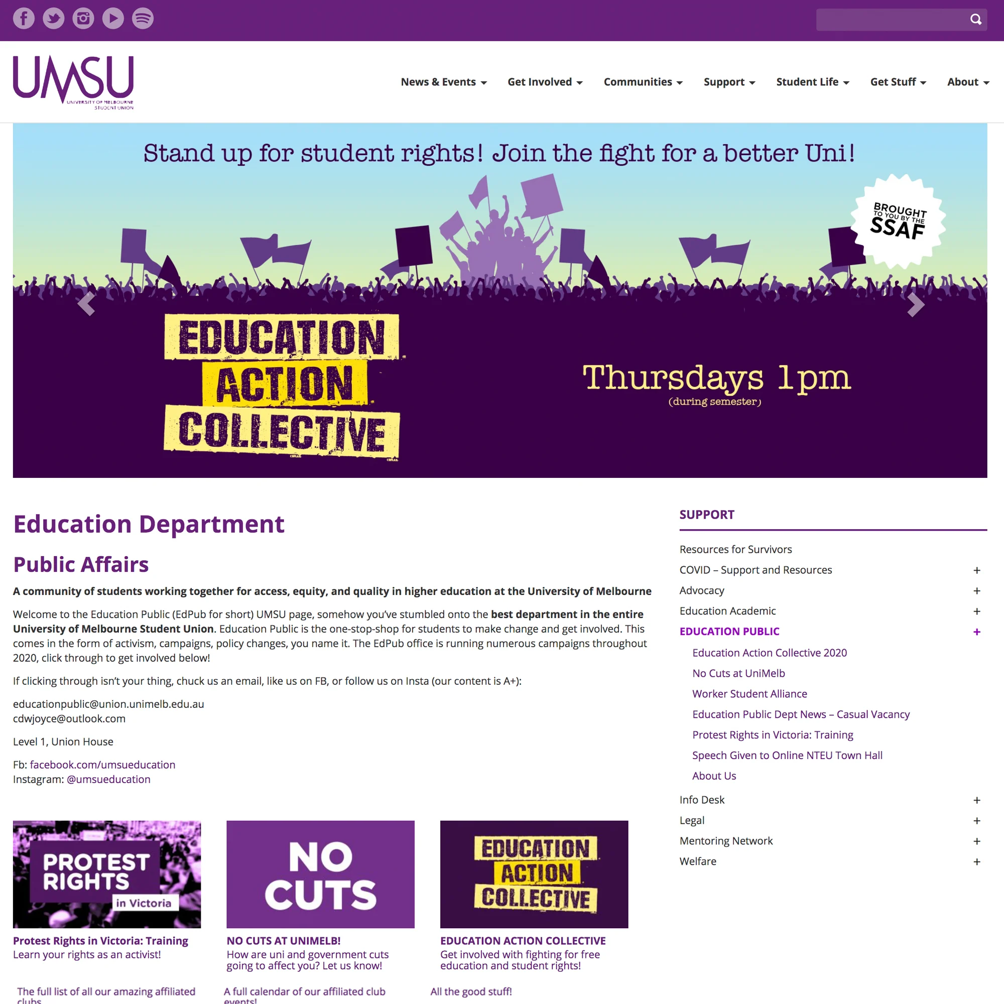
UMSU website
The University of Melbourne Student Union asked us to redesign and create the framework for their massive communications hub. A real challenge.
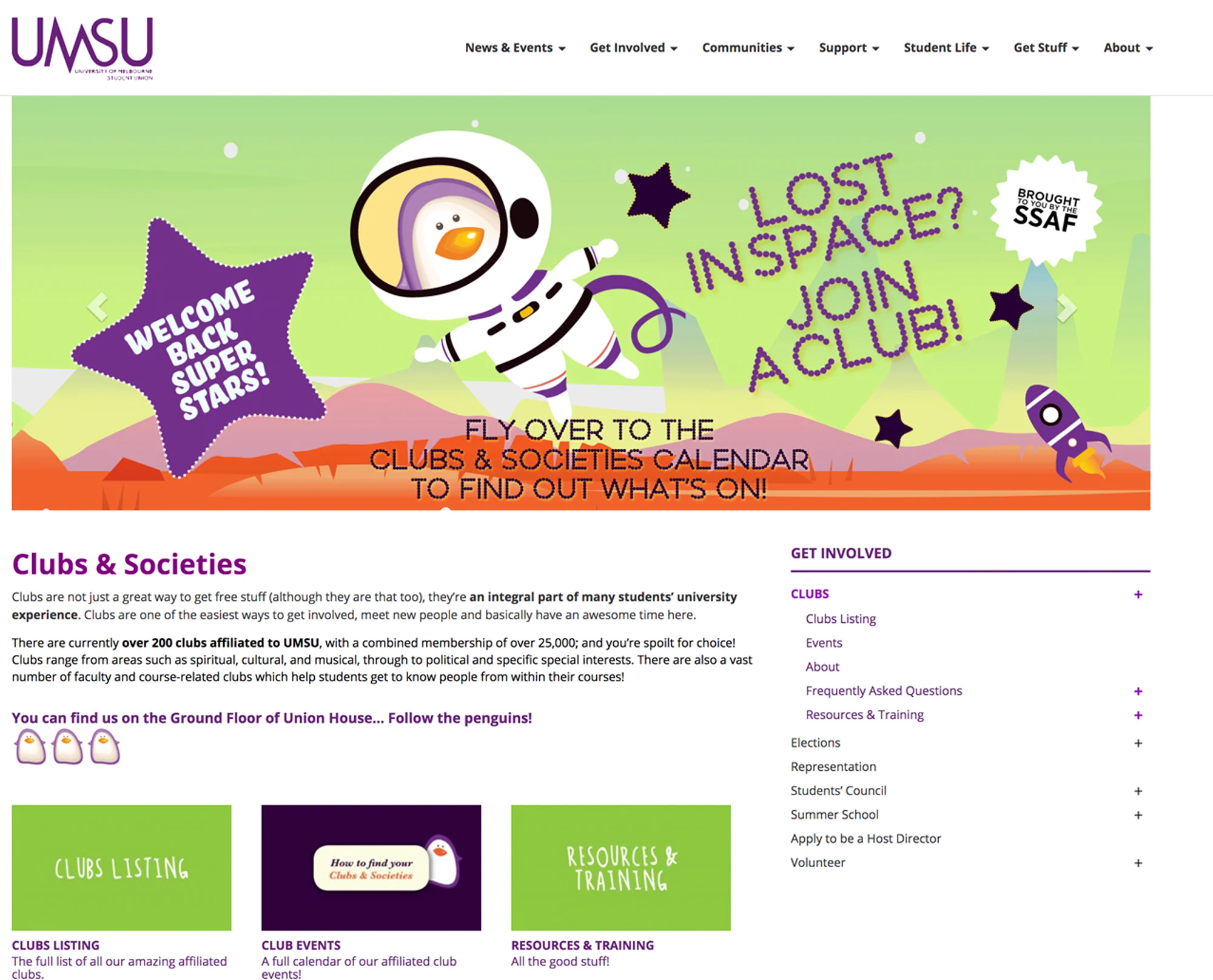
One of the great joys of this project was the opportunity to work with so many immensely creative people with what seemed endless energy. We really appreciated the experience.
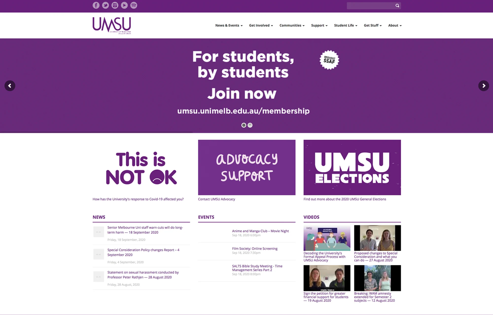
The news channels bubbled with all kinds of information.

We designed a logo for a well known artist who creates hand-blown glassware, this matched her style.
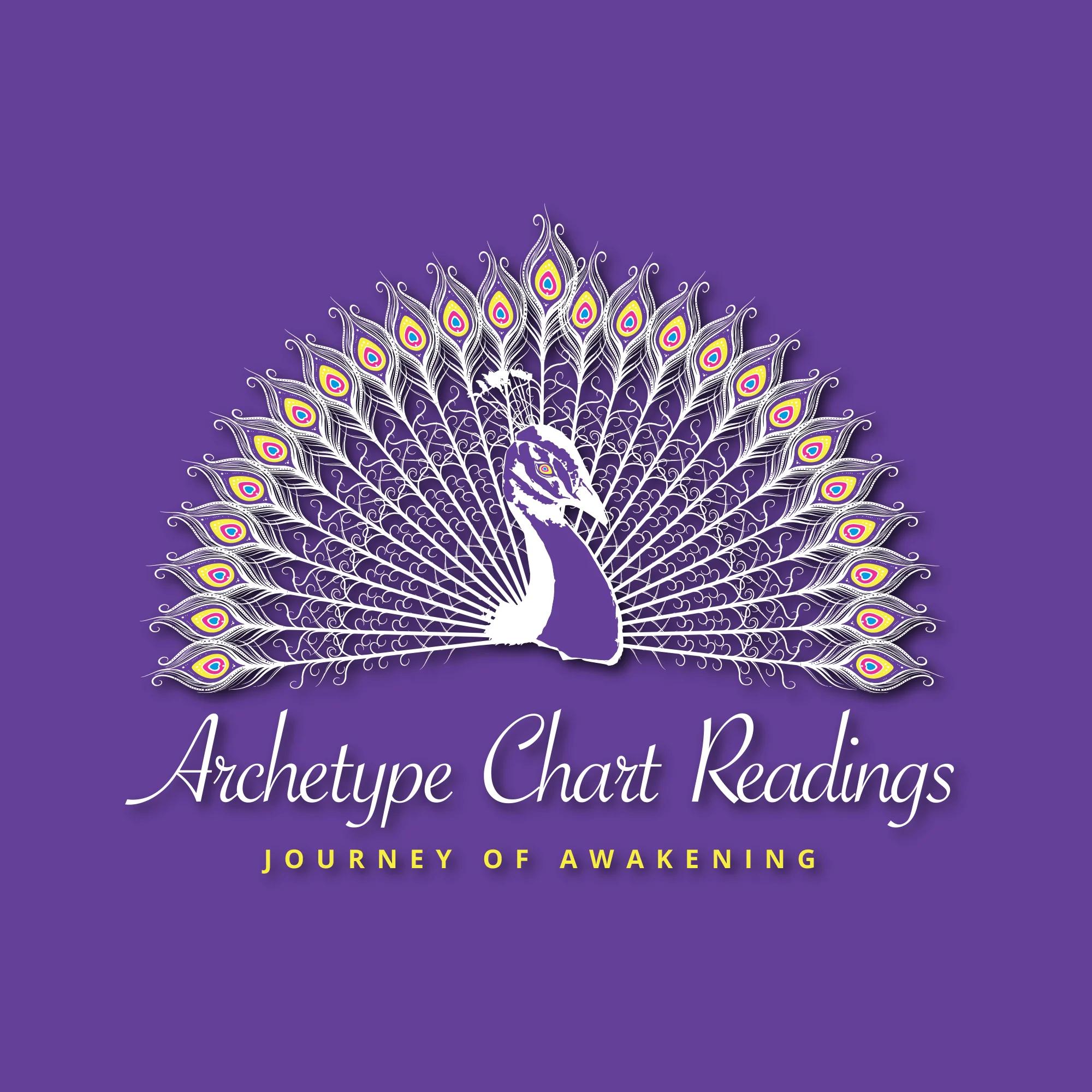
A new age practitioner needed something to present her rather unique services. A white peacock symbolises purity, spirituality, and divine connection, representing enlightenment, rebirth, and good fortune across cultures.

A trade services company specialising in painting and roofing needed a logo refresh. Before the paint had dried, we rustled one up.

A mens choir needed to have a logo that represented solidarity and a collective spirit. We'll sing their praises any day. We'll always donate our services to support a good cause.

Quirky folk singer-songwriter Bob Crain needed something to represent his brand. We obliged.